My favorite knowledge management tools is logseq. It’s privacy first and I have full control over my data which makes it stand out from other solutions which often come as SaaS nowadays.
I’ll probably write a blogpost about logseq basics in the future. But today - because I was just fiddling with CSS to customize my logseq experience - I wanted to share some CSS examples. Maybe it’s useful for you too.
Warning: I’m not experienced in CSS. I just did this by trial and error with dev tools to have a more pleasant logseq experience.
To use examples yourself you can add them to Settings > Edit custom.css
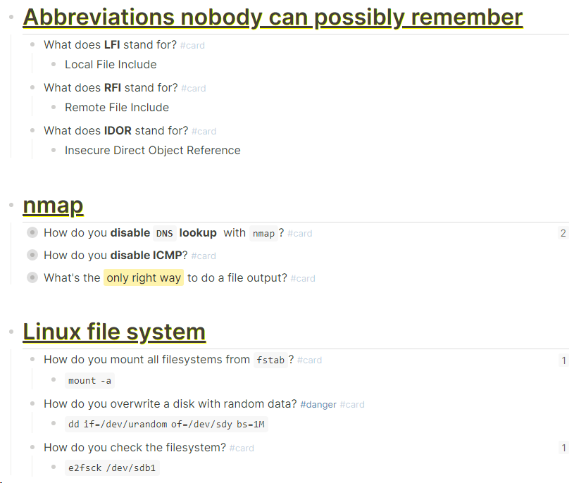
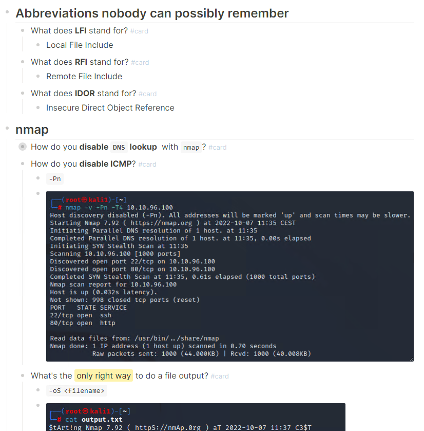
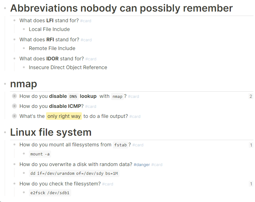
remove formatting from flashcards
I like to have a lot of flashcards within my pages just in the middle of any other text. Padding, box and shadow are a distraction to me. That’s why I removed them. I left the CSS in a format so that you can still edit the values from none to something else.
div[data-refs-self*='"card"'] {
border:               none;
box-shadow:           none!important;
--webkit-box-shadow:  none!important;
padding:              0px;
}
default flashcard design
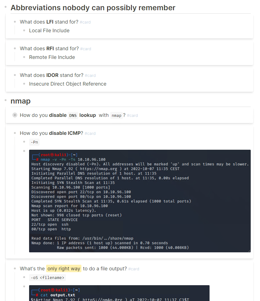
with modification
highlight tags
When I write down more dangerous commands that I should better not accidentally copy and paste somehwere, I added a red border around any block that is tagged with #danger. You can use another tag and color of course.
div[data-refs-self*='"danger"'] {
border:               solid;
border-color:         red;
padding:              4px;
}
modified highlight overlay

change formatting for image overlay
I don’t like that I can’t properly see most of the image when I hover over them. That’s why I changed it so that only the part with the action buttons has another backgorund.
.block-content .asset-container .asset-overlay {
background-image:   none;
}

.block-content .asset-container .asset-action-bar {
background-color:   var(--ls-primary-background-color);
border:             inset;
border-color:       grey;
}
default image overlay
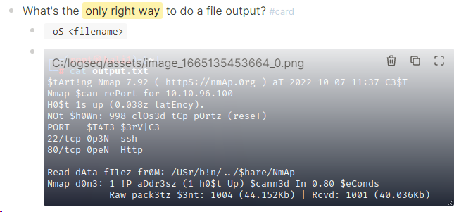
modified image overlay

disable tags in block references
Sometimes I like to summarize ideas or conecepts from other pages. While the tags on the original page makes sense, tags on those collection clutter the view, that’s why I like to not show tags on block references. You’ll still see the tags if you embed or hover over the block.
default block reference

which renders to the following image when you reference the block on another page and hover over it.

block references with no tags visible
The hover with all the tags is the same, but you don’t have the tags with the reference.

modify headings
I think the heading format should usually be handled by a theme. I like to have a huuuge padding above every h1 / # heading though. If I don’t I tend to add extra empty lines manually sometimes. That’s why I customized it a little bit.
The text-shadow I used in this example doesn’t work well with dark themes.
.ls-block h1 {
padding-top:      25px;
text-decoration:  underline;
text-shadow:      1px 1px #FFFF00;
}
defeault h1 heading
modified heading
